Law • Websites
João Cardoso Advocacia
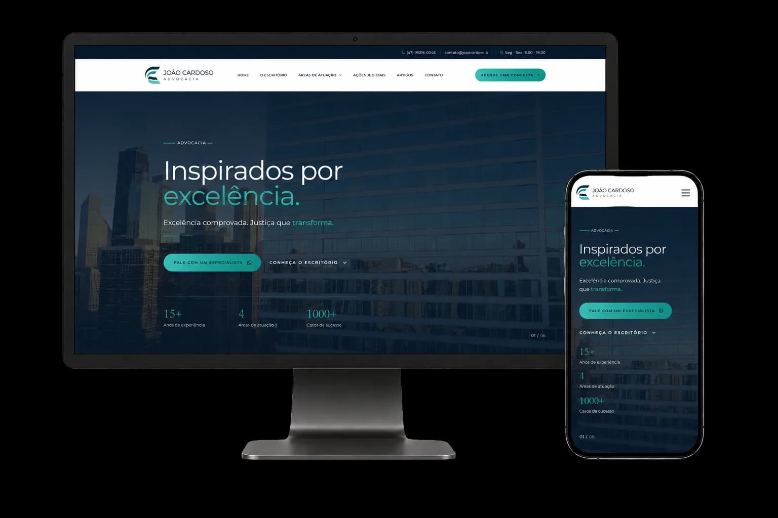
The project delivered a complete institutional website, with its own identity, specialized pages, articles, client reviews and several paths to contact the lawyer directly.
The challenge
Law depends on trust, and trust isn't built on a sophisticated visual presentation alone.
The website had to demonstrate technical knowledge, experience and the ability to work across disciplines. At the same time, it had to help people with very different needs identify the area of law that fits their case.
Another challenge was organizing 14 areas of law without creating navigation that felt long, confusing or repetitive.
The communication also had to balance authority and closeness, presenting the firm as a structure ready for complex demands while keeping direct, personal service as its differentiator.
The solution
We developed an institutional website on WordPress using an exclusive theme created by TP Webmaster for João Cardoso Advocacia.
The entire interface was built around the firm's identity, without depending on the look or the limitations of an off-the-shelf theme.
The structure combines a home page focused on brand positioning with inner pages for the firm, practice areas, articles, contact, privacy and information security.
The result is a site that allows a quick institutional read, but also offers depth for anyone who wants to understand the firm's services and experience.
Organizing the practice areas
The home page presents 14 areas of law in a visual interface that makes the services easy to discover.
Within each page, the services are explained in detail, letting visitors recognize situations that relate to their own problem.
That architecture avoids compressing the firm's entire practice into one generic page and creates specific content for different search intents.
Visual direction
The interface uses deep blue, light tones and green as an accent, creating an identity that conveys seriousness without reproducing the traditional look of so many law firms.
The typography pairs Montserrat for body text and interface elements with Cormorant Garamond for headings and editorial highlights.
That combination sets up a contrast between the precision of the information and the institutional character of the brand.
Subtle scroll animations, transitions, carousels and interaction effects make navigation feel more dynamic without competing with the content.
Building authority
The page dedicated to the firm presents its history, positioning, mission, vision, values and way of working.
We also created a full section for João Victor Gontijo Cardoso, gathering his education, specialization, courtroom experience, academic work and institutional involvement.
The home page also presents the firm's differentiators: technical excellence, strategic vision, multidisciplinary practice, transparency and individualized service.
These elements help visitors understand not only which services are offered, but who will be handling their case and which principles guide that work.
Legal content
The site has a dedicated area for publishing articles.
Content is organized by category, such as Succession Law, Corporate Law, and Medical and Health Law.
Each publication has its own page, prepared for longer legal content with headings, subheadings, lists, images and internal links.
Beyond offering useful information to the public, this structure supports an organic presence built on the questions potential clients search for before looking for a lawyer.
Reviews integrated into the site
Reviews published by clients on Google are loaded into the site.
The testimonials appear in a carousel on the home page, along with their source and the rating recorded on the platform.
That integration adds external proof to the institutional message, letting visitors see experiences published by the firm's clients.
Conversion journey
WhatsApp also stays available through a floating button, making it easy to get in touch at any point in the visit.
Performance
The interface uses minified CSS and JavaScript files to reduce the volume transferred to the browser.
Images were converted to WebP and load lazily, so files aren't fetched before they're needed.
The site also runs on a LiteSpeed server with page caching, cutting the processing required on repeat visits.
These decisions strengthen the project's technical foundation instead of relying on optimization plugins bolted onto a heavy structure.
Technologies used
- WordPress
- PHP
- Custom WordPress theme
- HTML5
- Tailwind CSS
- Custom CSS
- JavaScript
- Swiper.js
- Lucide Icons
- Google Analytics
- SEO
- LiteSpeed Cache
- WebP
Keep reading
More case studies.
Next step
Want a project like this one?
Tell us what you need to build. We answer with a direction, not a generic quote.
No cost and no commitment.